Front-End development and user experiences enhanced
The mission
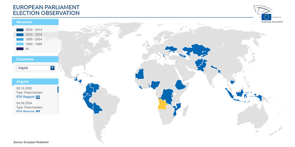
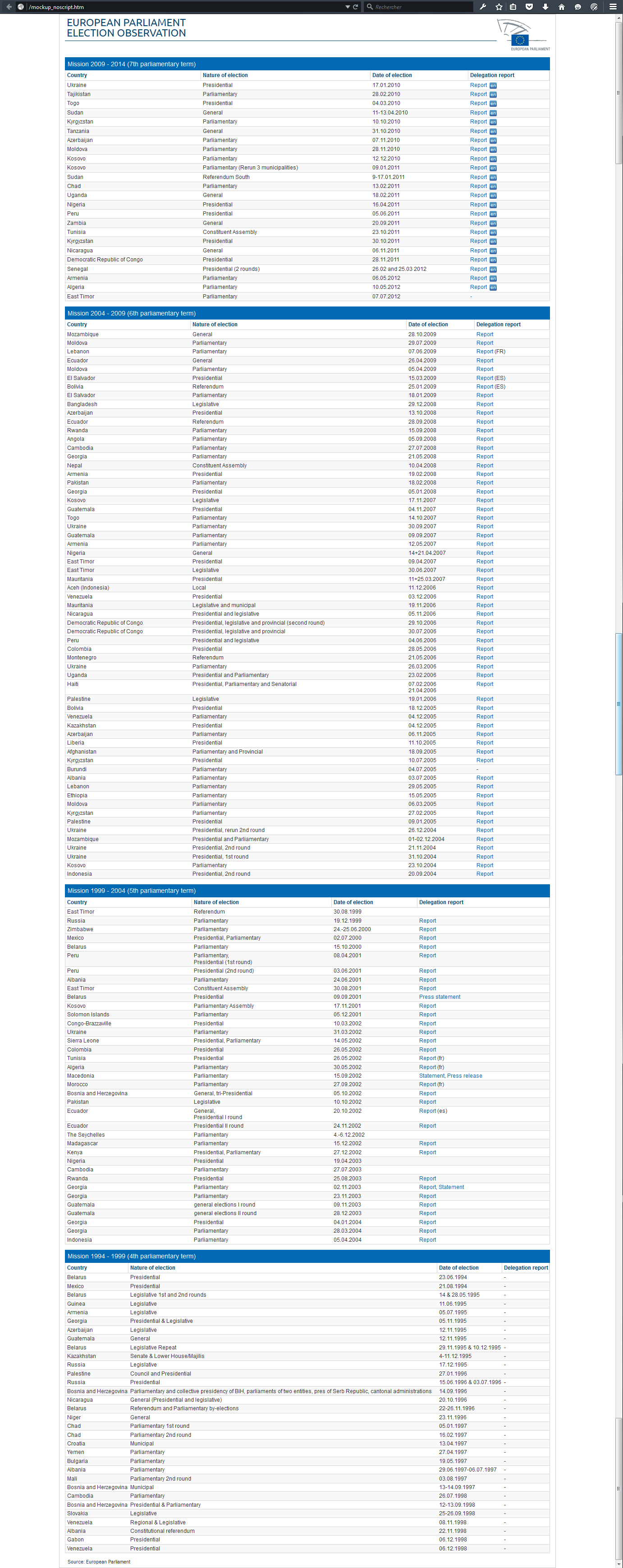
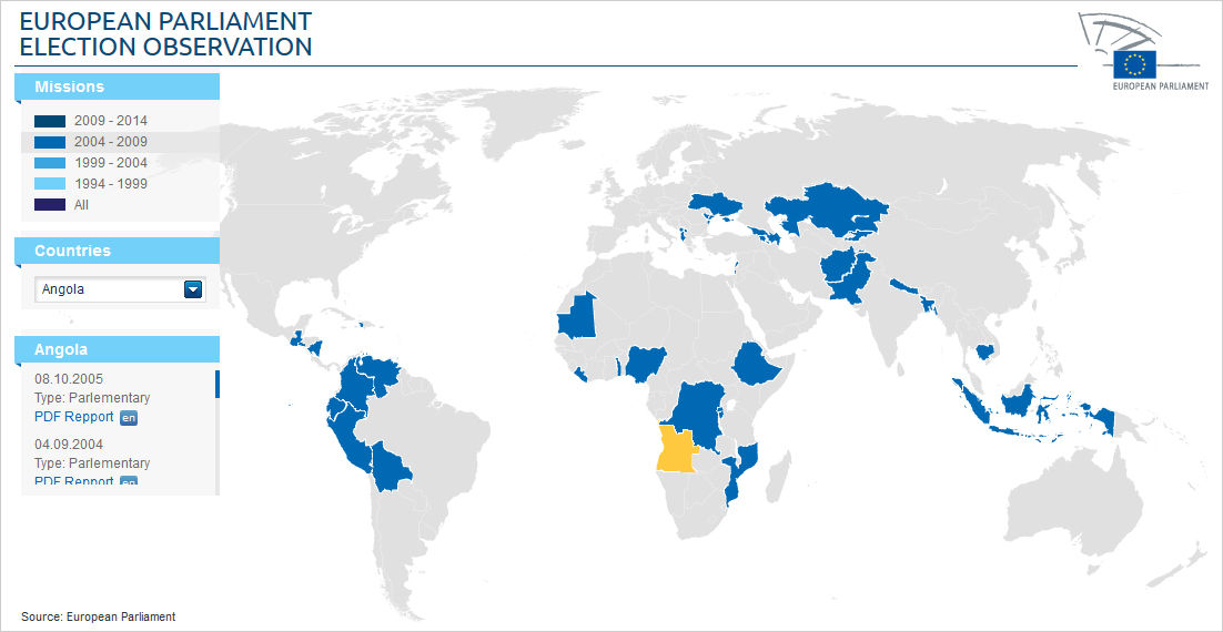
A table lists each parliamentary mission, the nature of the elections, the country, the reports drawn up, and the language targeted. And all of this is converted as an interactive infography with a worldmap.
Full JavaScript interactivity
This infography is entierly developed in JavaScript, and sorted by mission and by country. There are two ways to select a country : by clicking on it in the map, or by picking it up in the selector list.
In 2012, SVG and HTML 5 wasn’t compatible enough. So we had to find a solution with the tags “map” and “area”, and with the background images for the different election periods. An id selector, settled up is CSS, has to dispatch each tag in absolutes positions on the map and to manage hover states. After selection of the country and the mission, a panel lists the differents informations from the election and displays the report in the appropriate language – if available.


